

Rowdy Magazine is a student-run culture, fashion and media-focused magazine.
It was first founded in Gainesville, Florida in September 2018 as an effort to provide a creative outlet for local college students. Rowdy prides itself in not only the quality of the content it produces but also the community and voices that are elevated and heard.
The people are the core of Rowdy, and what differentiates the magazine is the very intentional thought and story. Rowdy isn’t afraid to be who it is: a collective of different voices and creative inputs that make a community: a family.
In this section, you will find the work that I did for Volume 11, Volume 10, the website, events, and social media.
[Creative Direction] [Print Design] [2023]
V.10: PICK YOUR POISON
Programs Used:
✧ Adobe Photoshop
✧ Adobe Indesign
Roles:
♡ Editor in Chief
♡ Creative + Design Director
♡ Graphic Designer
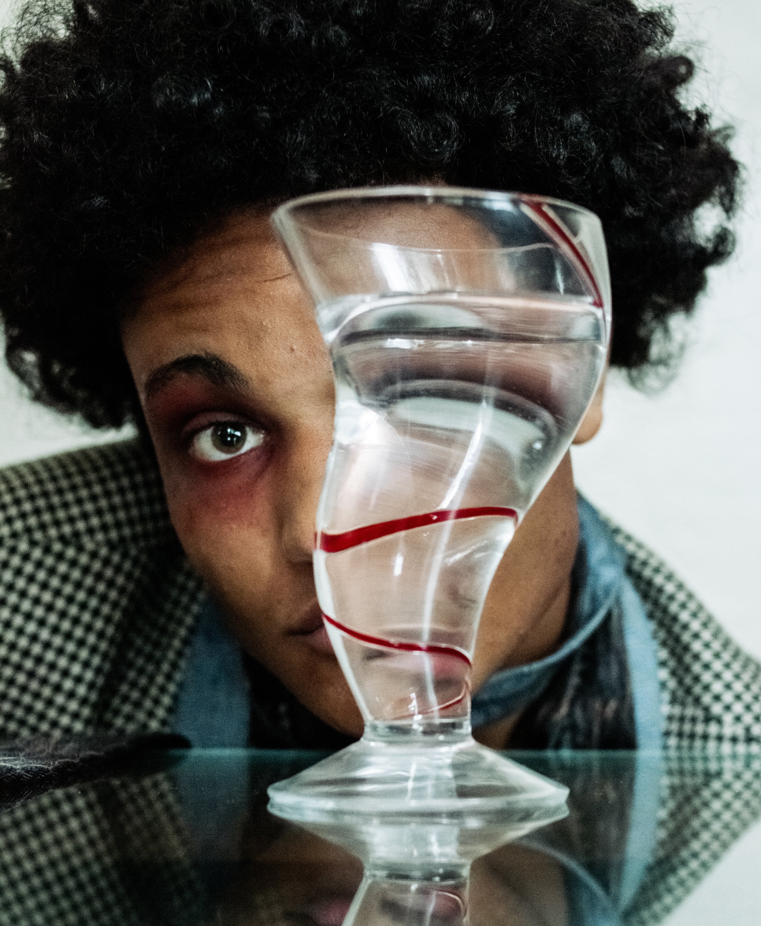
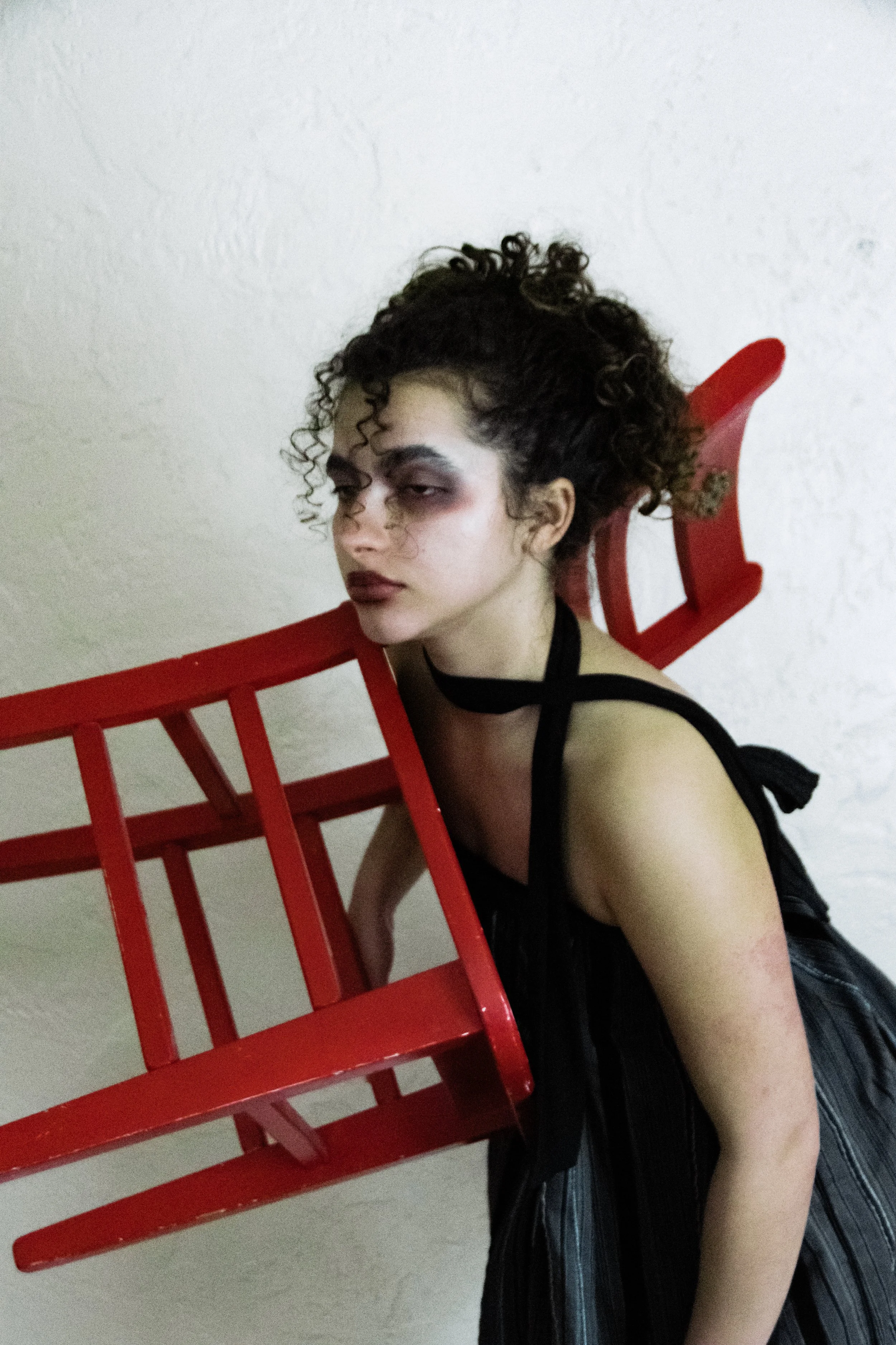
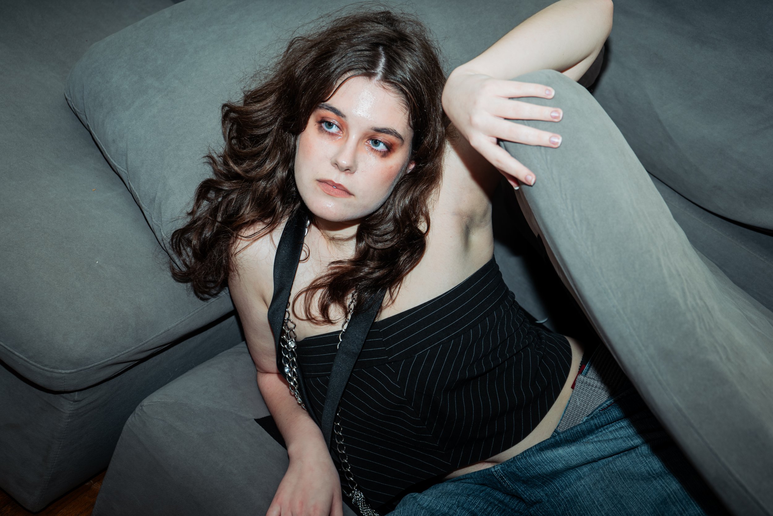
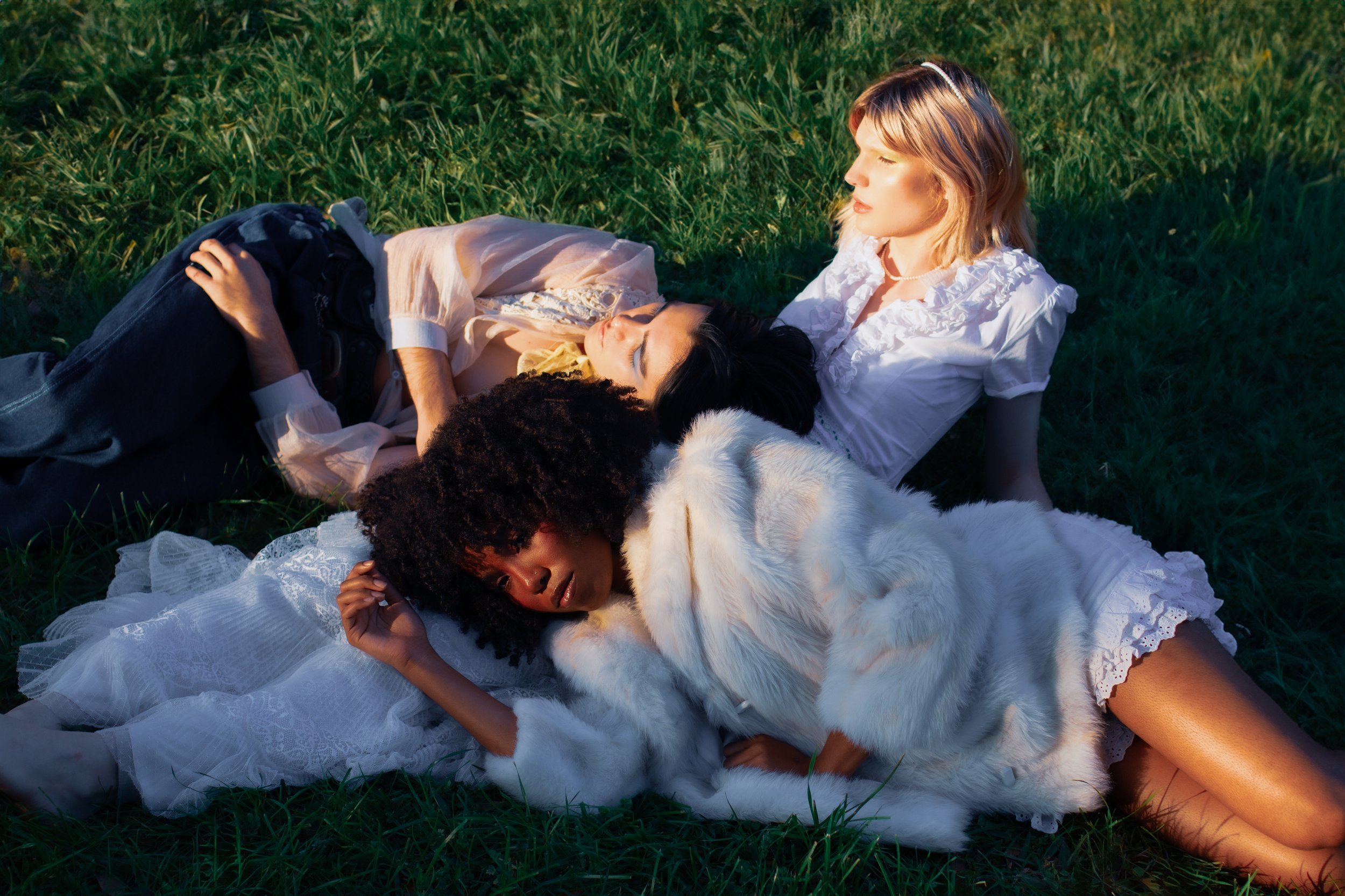
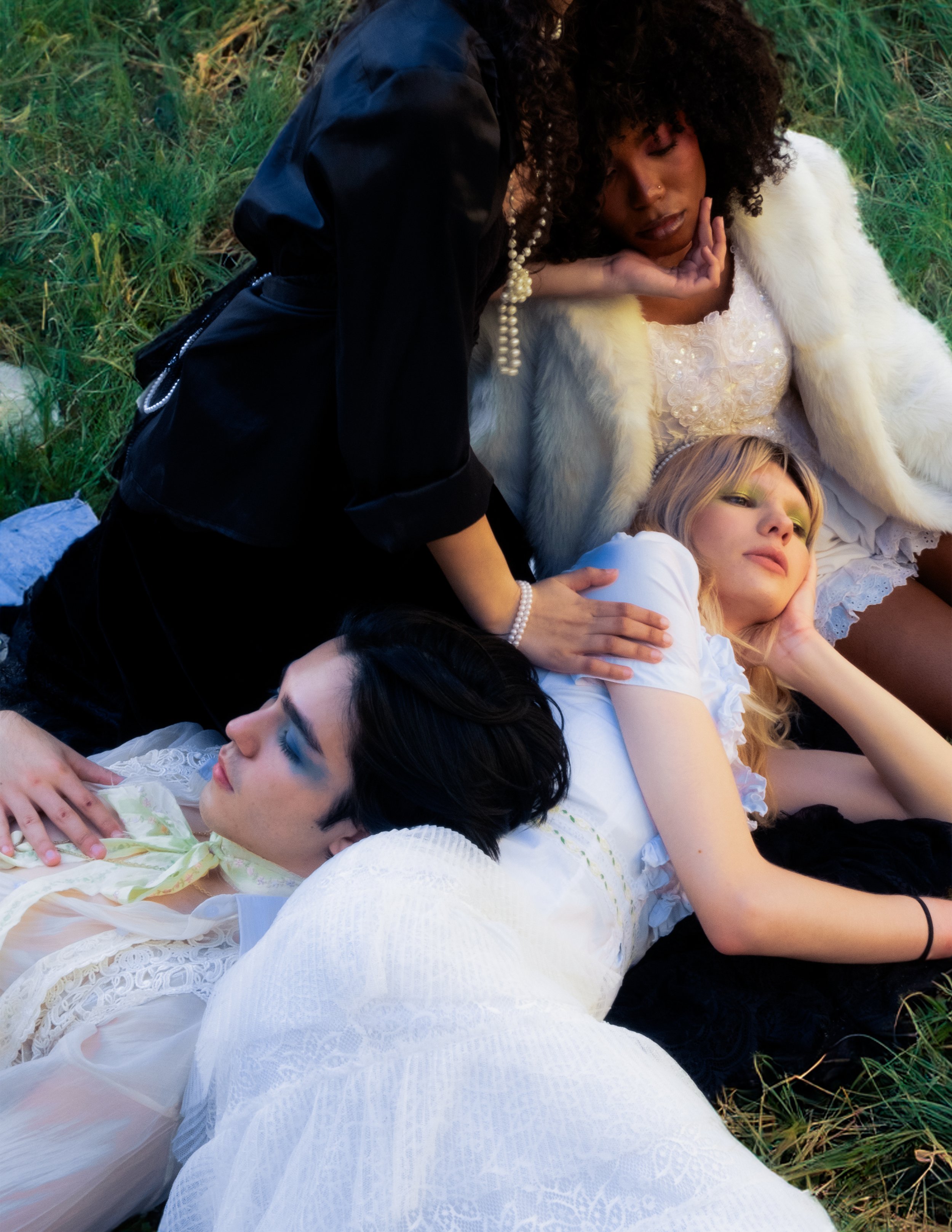
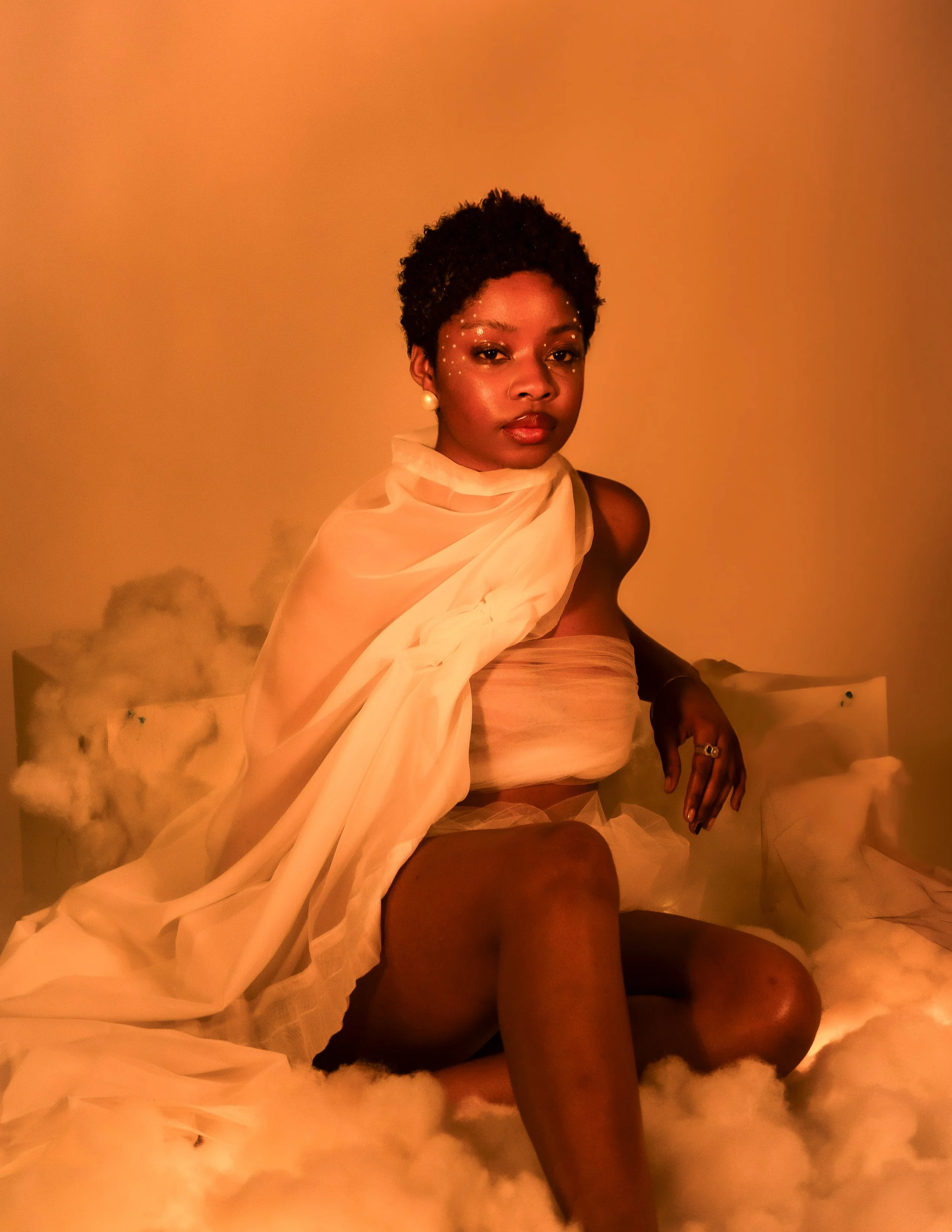
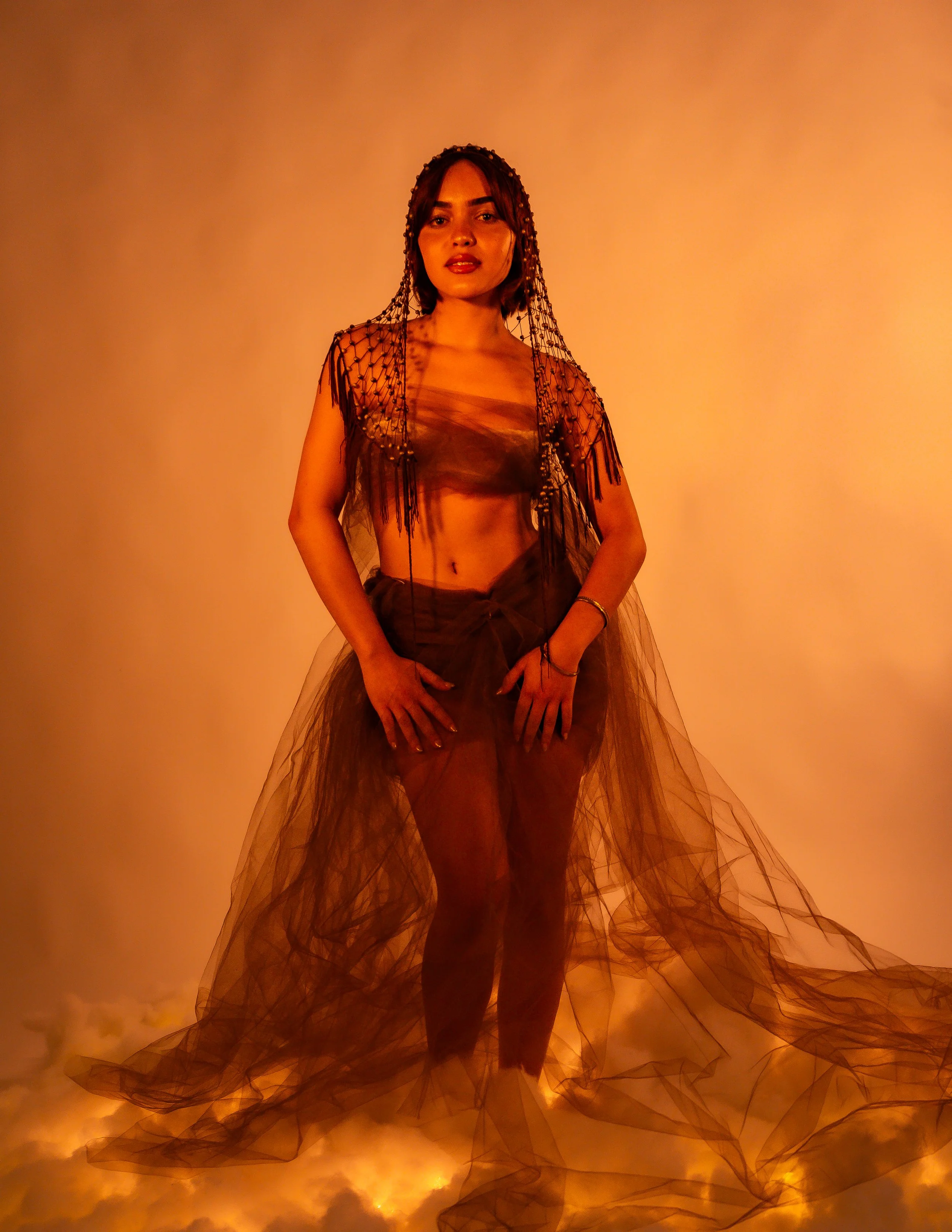
The intent when coming up with the creative concepts of the volume, designing, and putting together the final 100-page magazine for Volume 10 was to include introspection, reflection, and deep human connection. Each layout design, photoshoot, and article is intentionally put in an order in which the reader is taken through an experience.
As Rowdy’s 10th volume, the purpose of this volume is to show that there is darkness and lightness and all of us, and that the trajectory of our lives is never linear; that we need every part of ourselves and our lives to live and be truly human. Both reflect on the past while simultaneously looking toward the future.
The double cover (dark and light) allows the reader to flip through the magazine starting from either cover, insinuating that the.
The magazine itself including the layouts and the photoshoots progresses from dark to light and light to dark to show continuity and connection throughout its entirety.
The articles' layouts are weaved within the photoshoots in the volume to take the reader through an experience and story in whatever way the reader wants.
It starts in the dark.
All spreads above are designed by Tiffany Fang
Editors in Chief: Tiffany Fang, Aurora Jones | Creative + Design Director: Tiffany Fang | Photography Directors: Alex Renda, Kira Reinhartz | Photographers: Cheyenne Band, Jasmine Baca, Ian Alvarez Wade
[Print Design] [Creative Direction] [2024]
V11: WELCOME TO
YOUR IMAGINATION
Programs Used:
✧ Adobe Photoshop
✧ Adobe Indesign
Roles:
♡ Editor in Chief
♡ Creative + Design Director
♡ Graphic Designer
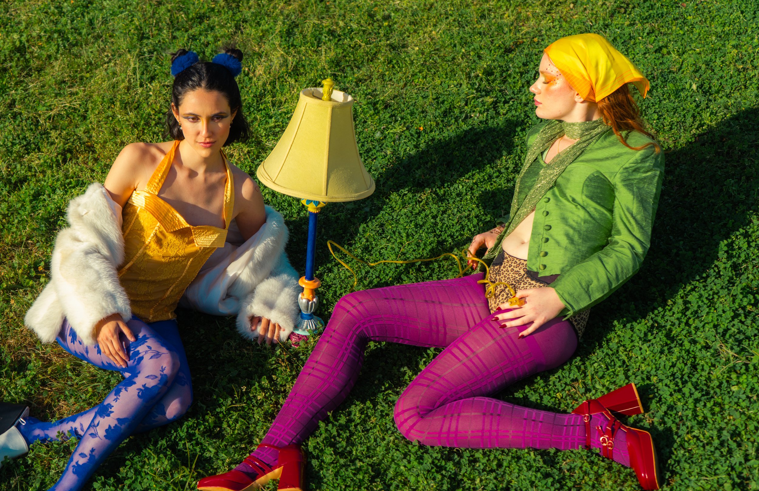
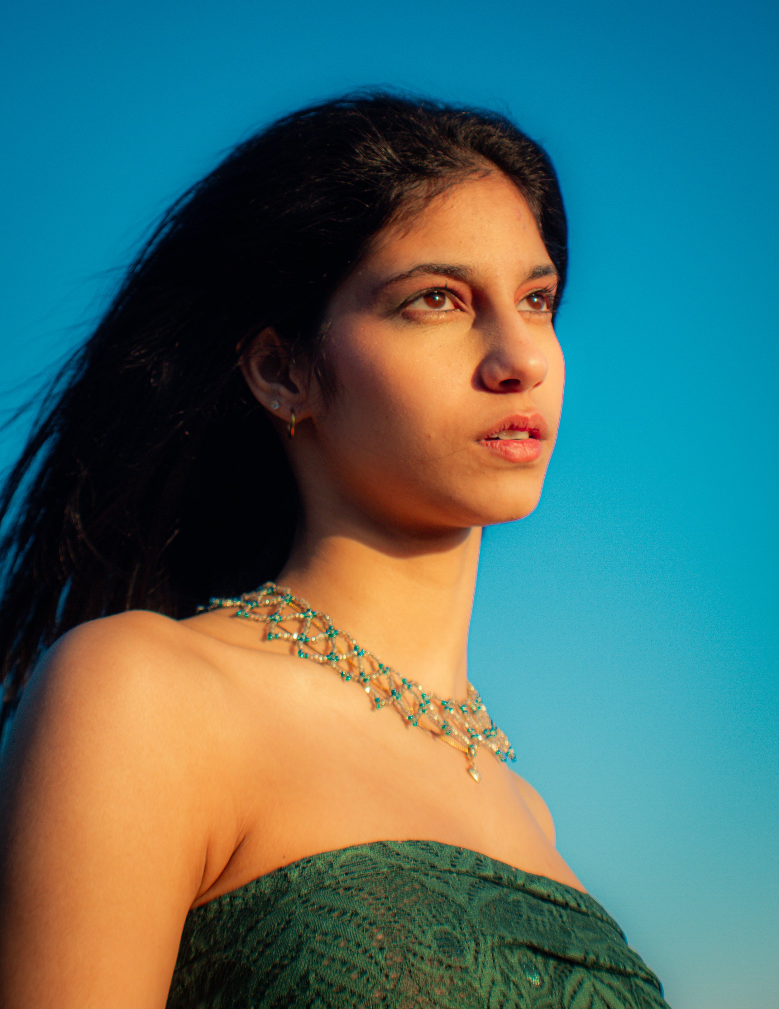
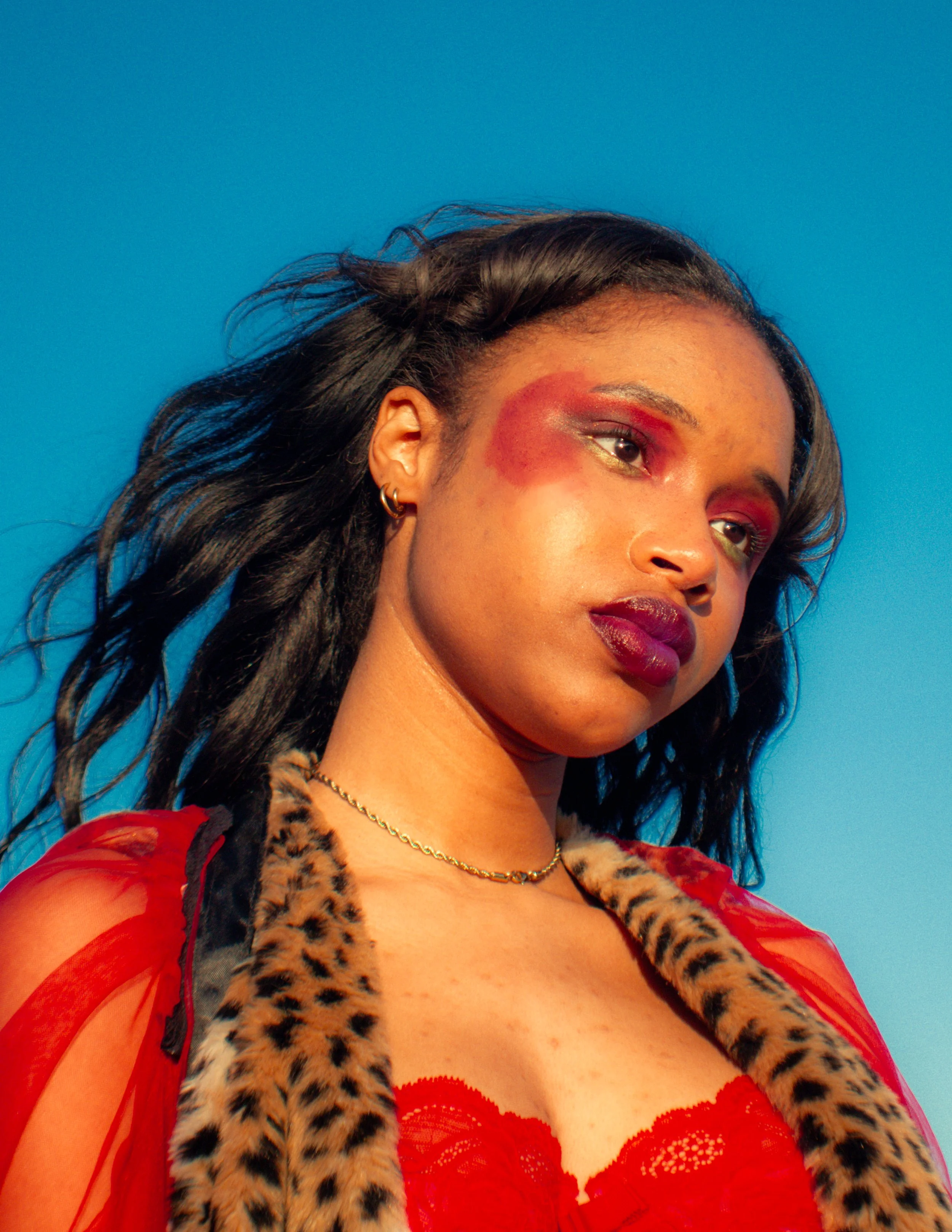
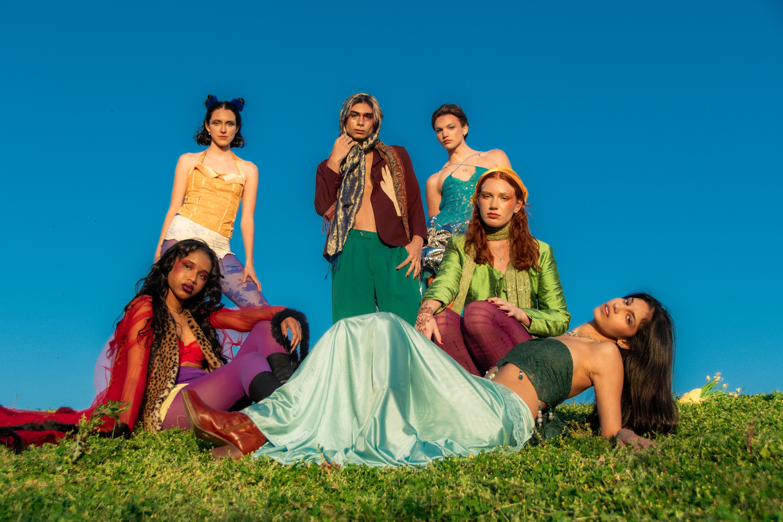
Volume 11 of Rowdy Magazine represented a catalyst for a new era of the magazine. With Volume 10 being incredibly introspective and digging deep into the human perspective, the intention for V11 was to signify an exciting change that marked the future for the next nine volumes.
“Welcome to Your Imagination” captures the entrapment that we feel in our minds. The overthinking and anxiety that come that feels suffocating and dark. The mind is simultaneously a terrifying and beautiful place to be.
But it also represents the slow escape from the prison of our minds and into our imaginations, the colorful and endless escape that we forget about past childhood, a favorite comfort place for many.
As one flips through the volume, each photoshoot and layout becomes more colorful, representing this sense of freedom to think however we want, representing the true beauty and vastness of our minds.


[Print Design] [2024]
V.9: THROUGH THE
LOOKING GLASS
As a graphic designer on this volume, I designed layouts spreads for two articles. I also created a full-page advertisement for a local business and a poster representing the volume's theme.
The theme centered around perceptions that people have of us, and how that in turn plays into our daily lies and perceptions of ourselves.
Programs Used:
✧ Adobe Photoshop
✧ Adobe Indesign
Role:
♡ Graphic Designer
Editors in Chief: Lola Piñeiro, Aurora Jones | Art Director: Callie Alexandar
[Web Design] [2023]
WEBSITE REDESIGN
Programs Used:
✧ WIX
Role:
♡ Website Designer
I worked with the past Co-Editors in Chiefs to redesign a new website for Rowdy Magazine.
The goal was to make the website match the editorial nature of the magazine more and make it feel more personal and less “club”-like.
This was my first large creative project that I did for Rowdy magazine and I really enjoyed it!
For colors, I chose green, magenta, and blue to convey the fluidity and colorful nature of Rowdy.
The past volumes of Rowdy ranged from an array of colors mentioned and I wanted Rowdy’s colorful personality to be shown on every page of the website.
I included more photos and videos to make the website more people-centered and more visual for anyone who were to encounter the website.
I changed the background to white to match the original logo, and to encourage the brightness of Rowdy as a magazine and organization.
For fonts, I chose an array of sans serif and distorted/ unique fonts to display Rowdy’s voice as bold, loud and creative to whoever is cruising on the website.
[Digital Design] [2023]
ROWDY HORROR SHOW
Role:
♡ Editor in Chief
♡ Graphic Designer
Programs Used:
✧ Adobe Illustrator
✧ Adobe Photoshop
The Rowdy Horror Show was a fundraising event done in collaboration ith three University of Florida fashion clubs (Thrift Club, Mode Fashion Club, and Fluidity Fashion).
A halloween fashion show was held in October 2023.
For this event, I helped create promotional graphics, social media graphics, and coming up with effective social media and creative strategy for the event.
I created three social graphics that were posted on both the club’s account and Rowdy’s account to feature the theme and people involved in every respective club to generate excitement for the show itself.

